https://indd.adobe.com/view/f2c932f2-c56e-4641-92f9-27dc42ed34d2
This is the link for my portfolio, done through Adobe InDesign. Overall, this class was probably my most challenging one, but also the one that helped me grow most, as a student and as a creative person.
Monday, December 11, 2017
Saturday, December 9, 2017
*EDIT*
The new video, with some improved quality!!
Friday, December 1, 2017
Magnetic Recording History
I thought this topic was pretty interesting. While the example we were shown didn't create music I personally liked, I thought it was pretty bold. I also think it's pretty interesting how floppy disks were created because of magnetic tape recording, and the need for a cheap way to transport software updates.
The article is clearly outdated, however, because it mentioned how VCR's will still be around for a long time, which we all know is not exactly true. I'm pretty sure the music industry has switched over to optical recording systems, despite being more expensive, since digital optical systems (think DVD's and CD's) are a lot more popular in households today than they were before.
The article is clearly outdated, however, because it mentioned how VCR's will still be around for a long time, which we all know is not exactly true. I'm pretty sure the music industry has switched over to optical recording systems, despite being more expensive, since digital optical systems (think DVD's and CD's) are a lot more popular in households today than they were before.
Sunday, November 19, 2017
Animation Tutorials + Videos
From the examples on Santiago's website, what stood out to me were the two Disney ones. It was cool seeing Steamboat Willy and then the Skeleton Dance, and how over time these cartoons were becoming increasingly complex. Steamboat Willy was just pretty much your basic black and white cartoon, while Skeleton Dance really worked on having all shades in between, and incorporated a lot of grey in there. It was a lot more detailed than Steamboat Willy.
The same can be said for the Felix cartoons, the first one was definitely more simple than the Halloween episode, which had a lot more use of shading and design work.
From the Norman McLaren examples, I liked Blinkity Blank, even though it was kind of hard to focus on it because the images did not stay on screen long enough. It was still visually really interesting, and the audio that went with it reminded me at certain points of this horror movie called Sinister.
The sledgehammer video was cool but his face expressions made me uncomfortable. I can't imagine how many hours it took the artists behind MUTO to make all of those individual wall paintings. It's kind of cool to see how you can transform any surface into art. The Brothers Quay example was very creepy, but incredibly creative. The Let Go video reminds me of the video for Do I Wanna Know, by Arctic Monkeys.
I think the most visual appealing ones are the graffiti stop motion video and the music video with the colored pencils. I think the stop motion sculpture could have been more appealing had it used more color, like the other examples I mentioned did.
I can't believe it took two years to do that music video with the candy. That is some hardcore dedication.
I actually follow someone on Instagram who uses a lot of stereoscopy, so I recognized that pretty easily.
Nothing was showing on the page that was linked under Dis 1.
Thursday, November 16, 2017
Animation Practice
This is my first try at animation with Photoshop. I colored in parts of a black and white photo of Lil Kim, a female rapper, and sped up the timeline.
Wednesday, November 15, 2017
Autoscopy Project
Not sure why this page is formatted this way, but the images are in order of quality, from 0% to 25% to 50%, 75% and then 100%. The original image is of several family members slaughtering a pig (I'm Colombian; sometimes for special events we prepare a pig for a meal called lechona). I photoshopped a picture of myself in a bikini being gutted open by two men with the Instagram and Facebook logo covering their heads. My autoscopy is supposed to represent how vulnerable I sometimes feel about social media. M biggest insecurity has always been about how I look, and sometimes putting myself out there on my Instagram and other social media accounts makes me self-conscious because I'm inviting other people to come look at me, criticize me, make fun of me, point out my flaws, etc. The best way to put it is that I feel like a piece of meat just waiting to be picked apart.
Wednesday, November 8, 2017
Photoshop Project
I struggled with the lighting in this one. The image of me running has three layers; the original, one where I painted over the shadows with both yellow and white paint and then made very opaque so it would lighten the shadows, and then the last layer where I played with the curve tool under image-adjustments, but I could not seem to make it lighten all over.
This was the original. I've come a long way, right? Haha.
Here's another practice at photoshop. My monster selfie definitely shows how much I've improved, as all I used to do in the beginning was stretch out images.
Thursday, November 2, 2017
Binary Code Translation of my name
01000100 01100001 01101110 01101001 01100101 01101100 01100001 00100000 01000101 01110011 01110000 01101001 01101110 01101111 01110011 01100001
This following sequence is my name in binary code: Daniela Espinosa.
This following sequence is my name in binary code: Daniela Espinosa.
Tuesday, October 31, 2017
Vectors Poster Project
Here is the original vs. the improved one. Santiago recommended adding something to the background to contrast against the purple, even though he suggested that there were too many colors. He also made it larger so that the poster would be easier to see from a distance. I like how the final version came out, definitely makes the heart stand out.
Thursday, October 26, 2017
3D Project
Saturday, October 21, 2017
Business Cards- Final Version
Each of these business cards represent a characteristic about me. From top to bottom, dramatic. empathetic, outgoing, playful and welcoming. These are the updated versions.
Monday, October 16, 2017
HW Assignment + Sketches
So for this assignment, I had to choose five words to describe myself and provide ten sketches that represent that exact word. My words were dramatic, playful, empathetic, outgoing, and welcoming. These are my (very rough!) sketches for each of the words:
Thursday, October 12, 2017
Milk and Honey Final Calligram
This is my final calligram project. It is just an image of a girl lying down on grass. Her body and the few pieces of grass by her body are made up of poems by Rupi Kaur, from her book Milk and Honey. I felt that the poems, which are centered around dealing with frustration, loneliness and acceptance of failed relationships, fit perfectly with this body that is just lying in a thoughtful but also tiring pose. Furthermore, these poems personally man a lot for me, so I enjoyed using them for this project. I struggled with properly tracing the image and filling it up with words; it took me several days, many hours and a total of 4 complete redo's to get to this point.
Wednesday, October 4, 2017
Calligram Examples
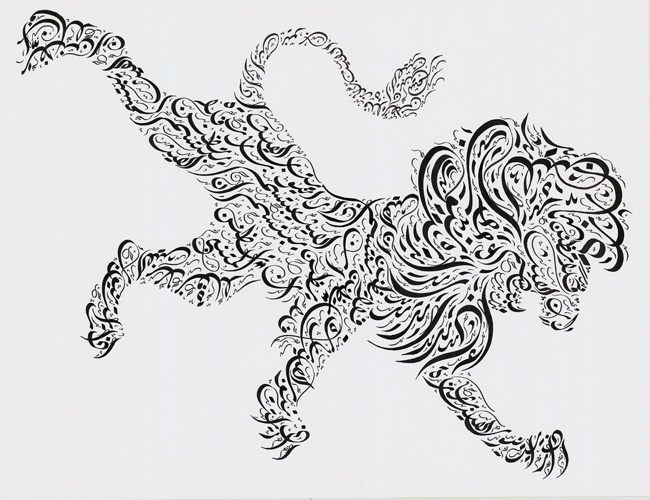
So my first example is this Islamic calligram of a lion. Intsead of drawing religious figures, which is against the Islamic religion, artists used calligraphy of important religious passages to form images. I think the calligraphy just looks beautiful in this form; it looks elegant to me.
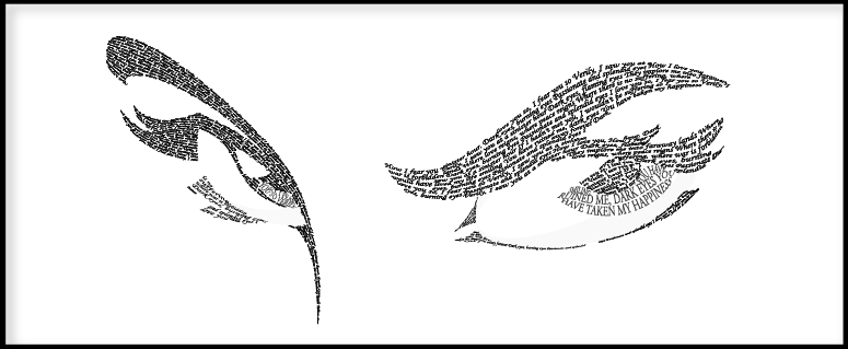
I love this example because there's actually so much detail that goes into the eyes. It looks like layers of words, and it makes the eyes look like they're sparkling.
These eyes are much more different than the other set of eyes, but I really like how dramatic they came out even though it's more simple.
I think this calligram is simple but very cool; a face is essentially made from shading and shadows. I think this is a smart way of starting a calligram project for beginners.
This is by far my favorite. I think the image itself is beautiful, and with the words describing pregnancy making up the image itself, it feels powerful and looks amazing. Definitely makes me want to do a silhouette of a person.
Tuesday, October 3, 2017
Final Canvas: IT Balloon
So this is my final version of the canvas project. It took me several days to do this, probably around a good 20 hours, half of which was spent on just trying to do the background balloon and the head shape of Pennywise, the IT clown. Most of the project was simple, it was just a matter of sitting down and being careful with every single part of the code. I'm getting better at mapping out the points.
Thursday, September 21, 2017
Tuesday, September 19, 2017
Wednesday, August 30, 2017
Intro
My name is Daniela Espinosa. I'm a student here at the University of Tampa. I'm a sophomore/junior, studying advertisement and public relations, and here I am, taking Digital Media. I've never considered myself the artistic type of creative person. If anything, I've always been more of a writer, so this class will definitely be a challenge. Of course, good things never come that easy, do they? I hope as the semester ends, I've gained the knowledge to conquer photoshop, coding and other computer/animation things that are currently a mystery to me. Who knows, maybe I'll uncover a newfound passion.
Subscribe to:
Comments (Atom)


