Tuesday, October 31, 2017

Vectors Poster Project


Here is the original vs. the improved one. Santiago recommended adding something to the background to contrast against the purple, even though he suggested that there were too many colors. He also made it larger so that the poster would be easier to see from a distance. I like how the final version came out, definitely makes the heart stand out.

Thursday, October 26, 2017

3D Project


 I did my 3D project on my inhaler, since I don't have any real decorations in my room. The only real details that I struggled with were the lines on the side, and I was given advice on how to make the text better by using the typing on a path tool. Overall, this project was probably the one I struggled with the least. The gradient mesh tool was not too difficult.


Saturday, October 21, 2017

Business Cards- Final Version


Each of these business cards represent a characteristic about me. From top to bottom, dramatic. empathetic, outgoing, playful and welcoming. These are the updated versions.

Monday, October 16, 2017

HW Assignment + Sketches

So for this assignment, I had to choose five words to describe myself and provide ten sketches that represent that exact word. My words were dramatic, playful, empathetic, outgoing, and welcoming. These are my (very rough!) sketches for each of the words:


Thursday, October 12, 2017

Milk and Honey Final Calligram


This is my final calligram project. It is just an image of a girl lying down on grass. Her body and the few pieces of grass by her body are made up of poems by Rupi Kaur, from her book Milk and Honey. I felt that the poems, which are centered around dealing with frustration, loneliness and acceptance of failed relationships, fit perfectly with this body that is just lying in a thoughtful but also tiring pose. Furthermore, these poems personally man a lot for me, so I enjoyed using them for this project. I struggled with properly tracing the image and filling it up with words; it took me several days, many hours and a total of 4 complete redo's to get to this point.

Wednesday, October 4, 2017

Calligram Examples

So my first example is this Islamic calligram of a lion. Intsead of drawing religious figures, which is against the Islamic religion, artists used calligraphy of important religious passages to form images. I think the calligraphy just looks beautiful in this form; it looks elegant to me.

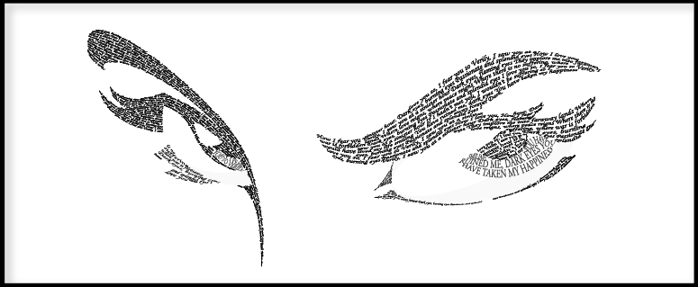
I love this example because there's actually so much detail that goes into the eyes. It looks like layers of words, and it makes the eyes look like they're sparkling.


These eyes are much more different than the other set of eyes, but I really like how dramatic they came out even though it's more simple.

I think this calligram is simple but very cool; a face is essentially made from shading and shadows. I think this is a smart way of starting a calligram project for beginners.

This is by far my favorite. I think the image itself is beautiful, and with the words describing pregnancy making up the image itself, it feels powerful and looks amazing. Definitely makes me want to do a silhouette of a person.

Tuesday, October 3, 2017

Final Canvas: IT Balloon


So this is my final version of the canvas project. It took me several days to do this, probably around a good 20 hours, half of which was spent on just trying to do the background balloon and the head shape of Pennywise, the IT clown. Most of the project was simple, it was just a matter of sitting down and being careful with every single part of the code. I'm getting better at mapping out the points.